
Compass Box Orchard House Blended Malt
They do say we should never judge a book by its cover. Its one of those lovely-in-theory, but ultimately rather too idealistic phrases. We all judge things by their cover every single day; people, cars, houses, erm…books, and of course whisky bottles. There may be more depth to be found beneath the exterior canvas, but its always the first thing you notice, and first impressions count. Marketing departments wouldn’t spend vast sums on the packaging if it ultimately didn’t matter.
Once we learn more about whisky and begin to “get our geek on”, the influence of the packaging does diminish as we discover things like how the spirit is made, which type of casks it was matured in and the joys of batch variation. We start to become more concerned by theoretical capacities and the size of the wash still rather than labels, and we are ever more curious to try more and more new whiskies. Despite this, I know packaging still has a role to play in deciding our purchases to some extent.
This all leads me to thinking about the current selection of whisky bottles on the market, and if there are any I may not been buying simply because I don’t like the design of the label or bottle. I haven’t bought any Benriach recently, and I do dislike the rebrand. It’s not offensive, and simplicity often works well, but it’s rather dull compared to the previous design. Bruichladdich’s bright blue Classic Laddie looks like something more at home in the shampoo aisle of the supermarket than the spirits section. I would like to think none of this would stop me buying them, and that something else has always appealed to me more whenever I have money to buy a bottle, but perhaps there is a bit of label snobbery going on in my subconscious. I’ve not bought any Ben Nevis since their rebrand either, although that is a fairly recent design change. To me, it looks like it was designed using Microsoft Word. The old one may have looked a little dated for the modern world, but that was part of its charm and appeal to me. I’d be similarly disappointed if Glenfarclas lost its iconic and traditional look, or if Diageo rebranded the Flora and Fauna or classic malts ranges with a jazzy new design. Some things just work as they are.
The past few months seem to have been particularly busy for marketing departments, with the fairly recent announcements of changes to Glenmorangie, Loch Lomond and Glen Scotia. My initial reaction to all of those was one of disapproval. The Glenmorangie design with the text layout ensuring many more years of incorrect pronunciation of the brand, and going away from that traditional look its carried for as long as I can remember, didn’t strike me as a great change. They even came up with some marketing buff about the colours reflecting the flavours of the whisky, despite the colours having not changed at all in the rebrand. They found a plausible reason for the original 10 being orange, with flavours of orange, honey and peach. Ok, I can go along with that. For the Lasanta 12 they talk about the red signifying rich, spicy sweetness. We’re getting more tenuous, but I can just about see that. The one that took the biscuit was the green Quinta Rubin 14, which apparently showcases the whisky’s bold and velvety forest-like depths. That’s rather weak in my view, but marketing departments will do marketing department stuff. Having said that, the simple design and colours, with the bottle shape from their Signet release is growing on me each time I see it.
The Loch Lomond and Glen Scotia bottles are essentially part of one big change across the groups whisky brands. Loch Lomond’s embossed glass with the words ‘Loch Lomond Distillery’ and the gold stag were a really nice touch on the previous branding, but I have since had a newly designed bottle in my hands, and I like it more now than I did from the pictures. The larger label with the bolder and more prominent Loch Lomond name front and centre works fine. Glen Scotia’s branding has gone a similar way, with cleaner looking labels, and the Glen Scotia name getting a much bigger typeface to stand out on the shelves. I clearly fear change, and need to learn to give these things more time to bed in before casting judgement.
Beauty is of course in the eye of the beholder, and one that seems to get a lot of stick, but I personally think is a massive improvement on the old design is Benromach. Let’s be honest, it didn’t have a high bar to beat compared to the previous “squiggly-writing” look. I know I will have lost credibility with some of you for suggesting that. Sorry.
Let’s keep the positive vibes going. Which other distilleries do I think are getting it right? Well, most of them if i’m honest. There aren’t too many duds out there. Particular shout-out to Springbank, Tomatin, Tamdhu and Raasay.
Where as the big brands and distilleries for the most part remain cautious with their labelling, independent bottlers are where you will find the more creative designs. As with most independent ventures, there is more freedom for expression and an ability to move away from the conventional aesthetics the mass market consumer would expect. The obvious ones to appreciate are Thompson Brothers, Chorlton, Whisky Sponge and Compass Box. More and more of the independents are turning to artists and designers to add shelf appeal, and I think I would be inclined to do the same if I was a bottler. It certainly seems to work. People want pretty bottles on shelves. I’d personally tap into the comic book sector. The contents of the bottle are unlikely to matter if some of the movies many of the fans lap up are anything to go by *ducks for cover*. Ardbeg have gone in that direction with their Planet Ardbeg creation, which is their latest attempt to be “cool” and distract you from the fact you are paying a high price for these non-age statement special releases. It works, whether we all like it or not.
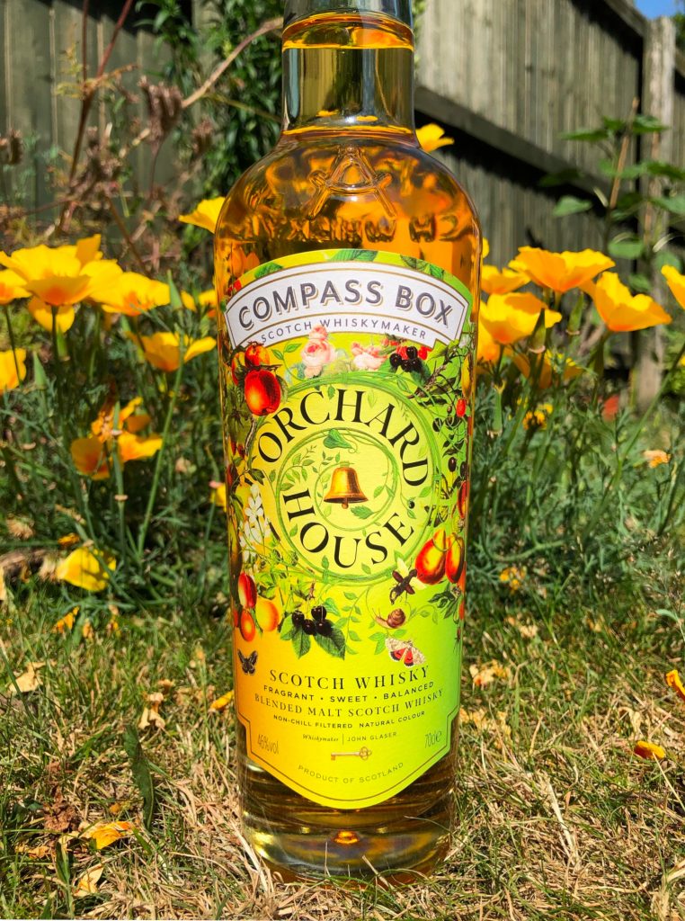
Compass Box often produce eye-catching labels, and this Orchard House is particularly appealing on that front. My wife’s first words when she saw it were, “That doesn’t look like whisky”. Is that a good thing? It doesn’t matter to me because I know it is whisky, but perhaps that is why we don’t see such eye-catching designs on supermarket shelves. Glenfiddich released their Orchard Experiment recently, and were a lot more restrained in their presentation, which is to be expected from such an iconic brand.
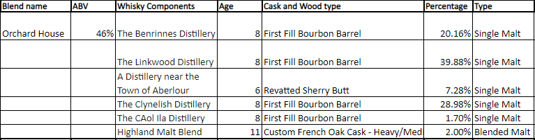
Compass Box will tell you on their website what is in this blended malt, the percentages of each whisky, and how they were matured and aged. Although my bottle code doesn’t appear to be featured on the website, and when I e-mailed asking if they had the information for my bottle, I didn’t hear back. Not to worry, the other batches have similar components, so we have a good idea. They have the details for an older and newer batch, but not mine which appears to be somewhere in the middle. Go figure. The most important facts to know are that it is bottled at 46%, non chill-filtered, natural colour and only around £40 a bottle. This batch I am reviewing is bottle code L 29 10 21, which appears to me is also the bottling date.
EDIT : Since this blog went live Compass Box have kindly got back to me with the batch details, which almost exactly mimics the first batch, with 1% more Linkwood and 1% less from a distillery near the town of Aberlour. Many thanks for that information.
Compass Box Orchard House Blended Malt – Review
Nose : Quelle surprise, it’s orchard fruit on the nose! Sweet, sharp and sour apple notes are very inviting, with a touch of pear in the mix too. We then get vanilla pods, some caramel, lemon zest and oak. It’s got a fresh floral white cotton linen vibe to it also, with a suggestion of earthy peat.
Palate : The nice balance between the sweet and sour apple starts things off on the palate too. There’s some slightly bitter oak notes coming in next, before it moves towards creamy vanilla and the continuing fruit notes. There’s a gingery lemon fizz which is very pleasant indeed, along with subtle, earthy and slightly smoky seaside peat. The light smoke continues into the finish, with a metallic note, chopped nuts, oak and salt.
Conclusions : The apple is the key note on both the nose and palate, so it has definitely met the brief. There’s a nice balance of sensations, and the delicate touch of Caol Ila peat that has been employed works very well. If you aren’t a fan of peat don’t let that comment put you off, its like a light seasoning rather than a strong note. Just a few PPM that adds something to the overall experience, and teaches any home blenders with an infinity bottle that a little peat goes a long way!
It isn’t the most complex of whiskies, but drinking whisky doesn’t always have to be a thoughtful or challenging experience, and the flavours present are very good. It’s a bottle you could sit down with for an evening either alone or with friends, and possibly get a bit carried away with thanks to its drinkability. It is available at time of writing for £39.95 at House Of Malt, which represents decent value.
Score : 7/10 Very Good
Three Word Review : Apple. Vanilla. Floral.
(Score descriptions can be found in the About page)
Vital statistics
ABV : 46%
Non-chill filtered : Yes
Natural Colour : Yes
Maturation : Mostly ex-bourbon casks, but check the fact sheet for a thorough break-down
Region : Speyside, Highland and Islay
Colour : Bright Gold
Without doubt labelling attracts – or not – customers.
I recently entered a bar in Sligo & the red label on Shortcross Rye And Malt stood out from the duller coloured bottles next to it.
I do however enjoy a spot of blind tasting to strip the mind of any bias/prejudice/pre-conceived notions to concentrate on the flavours – which for me are why I enjoy whiskey.
Often it’s a surprise what wins out on the flavour front!
That’s the perfect example of where a label really does make a difference, with bottles lined up behind a bar where you can’t always get a close look. I love a blind challenge too, especially when it unearths a whisky I may have looked past beforehand.